Envisioning the world of tomorrow is not enough to make it. Our society is heavily reliant on execution, and that means equal parts of form and function. Design makes all the difference in how we perceive the world, how we choose to buy a certain something over something else, but also how technology makes its way into our hearts (and homes). Where form meets function, our world isn’t just more appealing, it’s also more efficient.
In this discourse we will focus on three areas where design enhances our perception of the world, turns computers into companions, and makes us truly feel at home in our homes.
Art, meet marketing
There’s bad marketing, there’s good marketing, and then there’s really great marketing. I’ll let you guess which category this falls into.
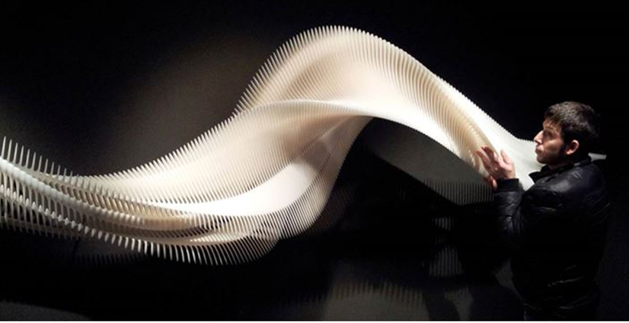
This sculpture is the work of digital designer Daniel Widrig. He was hired by Nike to come up with something that captures the essence of the body in motion. He set out to create a sculpture that, while motionless, still appeared to be moving – evolving but also decreasing in size, accelerating but also slowing down. Using invisible cuts and snap connections, Daniel designed the 4-meter-long sculpture so that appeared to be a dissolving object moving through space.
Drawing it wasn’t the problem. Achieving it, was. Daniel mashed a series of digital photos into a complex and intricate piece that would have been impossible to render using traditional technologies. The people at Materialise helped him realize his vision by slightly modifying the design of certain pieces to make the sculpture buildable, taking into account the varying weight load of each part, as there was more weight on one end than there was on the other. Three separate parts were built using the Mammoth Stereolithography Machine, one of the few engineering tools able to achieve cuts and connections so small that they appeared invisible to the naked eye. The challenge was to make the structure look whole, as if created from a single block of material.
So how did a motionless sculpture, that looked like a dinosaur spine more than anything else, enhance the public’s perception about running shoes? Simple. It looked stunning! The sculpture itself bears no indication as to what it is, or what its purpose might be. It just strikes you. Placed next to any physical good, it automatically enhances your perception of that object, leading to a greater chance of you looking into the whole conundrum. Needless to say, it served its purpose selling the running gear.
User Experience (UX)
Software design has two main parts – development and implementation. It consists of choosing a solution’s frameworks, scopes and goals, and realizing them through design. You want an app that’s easy to grasp but does complex work at the same time. Good designers know that doing their part is essential for a solution’s usability, durability, and long-term success. There are some golden rules of good UX design. Some articles break them down into 10 or more, but really there are just three key areas that a designer needs to nail. According to UX guru Theo Mandel, those are:
1) put the user in control
2) reduce the user’s memory load
3) slap a consistent design
And here’s how:
1) avoid using design models; allow for flexible input (mouse or keyboard, mouse and keyboard etc.); display descriptive messages on first run; provide reversible actions and meaningful paths; allow to set difficulty levels.
2) facilitate recognition instead of recollection; use memorable, clear visual cues and standard patterns; provide shortcuts and defaults; make the user’s progression clear; use real-world metaphors.
3) make the GUI appealing to promote a positive first impression as well as positive attitude; encourage exploration by making the GUI predictable (including keeping interaction results the same); maintain consistency across devices (keep the mobile and desktop versions of your software in line with each another).
There are, of course, numerous other tiny aspects to consider – such as embracing gesture-intensive design, motion input, menu animations, etc. – but these basic rules are what keep UX design on the right track. The concept of First Time User Experience (FTUE) should be all-too-familiar to those who do UX for a living. As one of the most important parts of a successful app, good FTUE ensures that:
- new users are hooked in the first 30 seconds;
- it takes only about 5 minutes to learn how to operate the app’s most important components;
- users experience the coolness factor;
- users get clear direction;
- users reap clear benefits within minutes.
There is a complex relationship between data and design in UX. This captivating TED talk by Rochelle King, Senior Designer at Spotify, explains it well. Enjoy!
Smart homes
As cloud computing becomes the norm, so does the Internet of Things. Cloud technologies enable us to control things from afar with great flexibility, and that includes machines talking to one another (M2M). But one cloud application that anyone can benefit from is home automation: centralized control of lighting, heating, ventilation and air conditioning, security locks and doors, etc., with the ultimate goal of providing convenience, energy efficiency and safety.
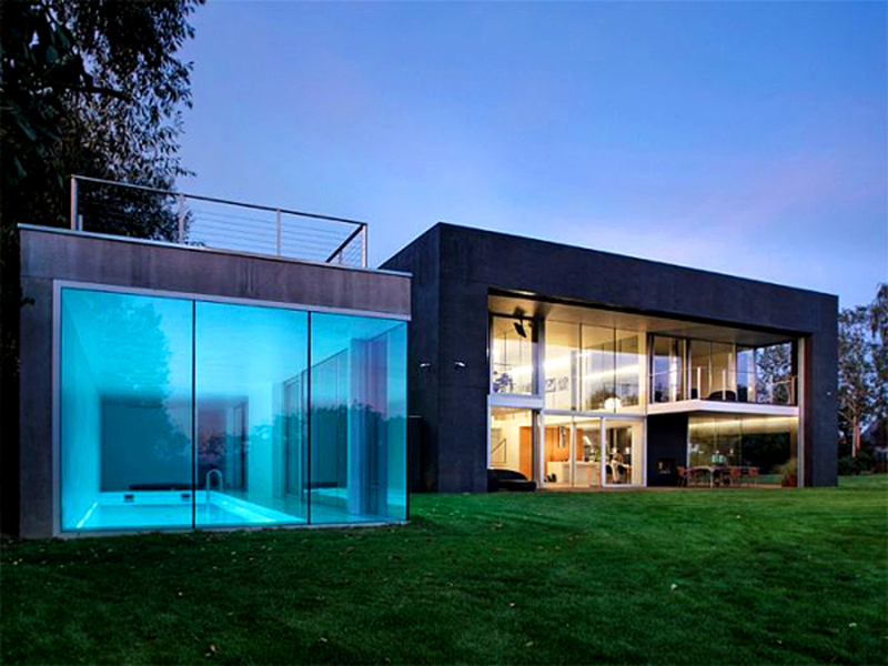
A smart home also offers the ability to control domestic activities like houseplant watering, home entertainment systems, changing the ambiance, pet feeding, and others. Most of these appliances are either hidden from plain sight or they blend with the home, to keep things nice and pretty. A typical scenario:
7:00 AM: Your favorite radio station wakes you up, the lights gradually brighten, the thermostat adjusts to your preferred temperature, all this while the shades slowly rise.
8:30 AM: As you head out, your doors lock and the lights turn off behind you.
13:00 PM: Your pet feeder dispenses some much needed chow for your two grumpy cats.
18:30 PM: As you arrive, the garage door opens and the alarm system disarms, simply by sensing your presence (i.e. your smartphone); the doors unlock and the light to the entrance turns on.
20:00 PM: As the sun sets, the outside lights turn on, the doors lock, and the windows shades close.
21:00 PM: Netflix time! As you switch on your media center, the lights dim to a comfortable movie-watching level and the fireplace lights up; grab your popcorn and hit Play!
23:30 PM: With a single button press, your lights shut down, the temperature sets back, and the alarm is enabled. Bed time!
A smart home blends functional design with aesthetics, not compromising one for the sake of the other. Design isn’t synonymous with appearance. The way an object looks and feels determines not only how it is perceived, but also how it serves its functional purpose. In the words of Dieter Rams, Braun’s famous designer, “Good design Is as little design as possible.”


Post A Reply