In this final article of the Positioning in CSS series, we’ll describe the floating concept.
What Is Floating
Floating is used to place an element to the left or to the right of its containing block. This can be very easily achieved by setting the float property either to the left or right. In the following code snippet, all the elements under the box class are set to float to left.
.box {
    float: left;
}
 This code could be used to arrange a set of block elements to float to the left of the page.
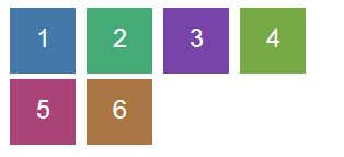
The visual representation should look as shown in the image on the left.
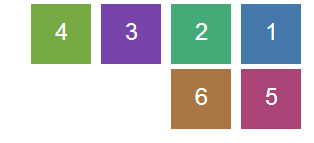 Each box has been numbered in the order boxes have been declared in the HTML code. If we were to change the floating to the right side, it should look as shown in the image on the left. As you can see, when there’s no space left for floated elements, they are placed beneath the other floated elements.
Floating Mechanics
Let’s look at the particularities of the floating concept.
When an element is floated, it leaves the normal document flow. It is placed to the left (or right) of its containing block, as soon as its previous siblings have also been floated. The images above reflect the process in question. Floated elements can still have margins and, when positioned, they take into account the padding of the containing block.
In general, only block elements should be floated, but in fact any element can be floated. Their display property automatically changes to block.
Position And Floating
 In our previous article, we discussed about how you can adjust the position of an element using the CSS position property. This time, let’s analyze the floating mechanism. Naturally, you may wonder how these two interact. Floating only works with static and relatively positioned elements. In the case of absolute and fixed elements, floating is ignored.
We’ve already seen how static elements are positioned when floating. For relative elements, the only difference is that you can use the top, bottom, left and right properties to adjust the position of the elements. As stated in our previous articles, changing the relative position of an element will only change the position of its visual representation. The document will still treat it as if it were static (i.e. see it in the same position). This also applies for floated elements.
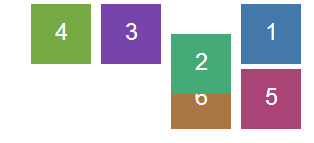
We’ll only apply a small change to our previous example of right-floated elements and will position the second box relatively, with a top position of 30 pixels. You may notice that it will overlap the element beneath (the fifth box), while the other elements will preserve their regular position.
Clearing
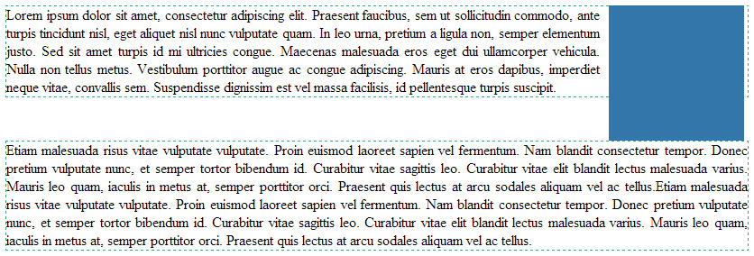
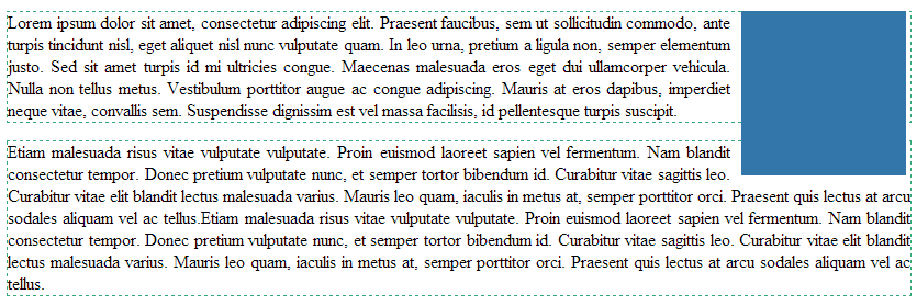 By default, elements positioned near a floating element are displayed in line with this one. As shown here, a blue box is floated to the right and two paragraphs are displayed next to it.
The paragraphs have a dashed border, which makes them more visible.
 This effect has been achieved with the help of the clear property. However, in certain situations, we may need to have the second paragraph displayed beneath the floating element, as shown in the image on the left.
You can see it in the following code snippet.
p.cleared {
	clear: right;
}
We used the right value for clearing. This ensures that any paragraph under the cleared class is positioned beneath right-floated elements. If the blue box floated to the left, we would have used the left value. There is also the both value, which positions an element beneath all floating elements.
Conclusions
Floating is very useful in various situations, such as showing text around images or implementing layouts with multiple columns, where each column is floated. The advantage is that horizontal scrollbars are not displayed when using floating elements, unless the size of the floated element is bigger than its containing block. Also, with the help of the clear property, a footer can be displayed beneath floated columns.
We hope that our series of articles made CSS concepts such as positioning, containing blocks, and floating more clear, thus helping you build great layouts for websites and apps.
Leave a comment