This article aims at clearing up some of the misconceptions about the CSS display property and the way it affects the box model. It will only take into account the W3 specifications. To avoid blurring you with all sorts of details and exceptions, various browser inconsistencies will be swept and kept under the rug. The purpose is to give you a clear understanding of the matter, so that you shouldn’t be afraid of doing more than changing colors from a stylesheet picked up from who knows what source.
Block Or Inline?
HTML elements can be displayed in two very distinct ways: inline or block. There are many differences between them, but the most important is that inlines flow one after another horizontally, until they have reached the end of the line, at which point they continue to flow on the next line. Blocks on the other hand flow one after the another vertically, and each of them basically occupies an entire line. HTML shows flexibility in allowing elements to flow and this is one of its benefits, as you can insert content in the page at any point and the entire page will rearrange itself to accommodate the changes.
The term flow, or formatting context, refers to the space occupied by inlines or blocks. Each formatting context is responsible for the rendition of its components and it does so according to the principles described above:
- An inline flow distributes its content in lines (useful if you want to display some text).
- A block flow renders each element on a new line (useful for separating the document in sections, like paragraphs).
A block flow also permits a higher degree of control over the placement and size of the contained elements, which is why when creating the layout of a web page, most of the time you will interact with block elements.
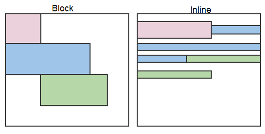
The diagram below shows the difference between a block flow with 3 blocks and an inline flow with 3 inlines.
While there are two important ways in which HTML elements are displayed, the display property can take several values, each with its own particularities. Let’s consider the elements with display:inline-block, for example. Not only they participate in an inline formatting context, but they also share some of the characteristics of block elements on the inside (width, height etc). Elements with display:inline-block act as inline on the outside and as a block in the inside. The particularities of inline-block elements are discussed in the section below.
Breaking The Flow
There are two important rules about the display property that children of HTML elements have:
- Children of an element are either all inline or all block.
- Children of an inline element are all inline.
However, if these rules are always followed, then you might ask yourself: How come we can write stuff like a mix of inline (span) and block (div) elements as children of an inline element and they still get properly displayed? The answer is anonymous blocks! HTML is very flexible, meaning that it allows all sort of weird constructs and does its best to make them work.
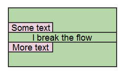
Let’s review the following example:
<span id="inline-box">
    <span id="first-inline-child">Some text</span>
    <div id="block-child">I break the flow</div>
    <span id="second-inline-child">More text</span>
</span>
In this case, to help preserve the two constraints mentioned above, the browser creates 3 anonymous blocks (think of them as divs) that split the #inline-box span and its content. The first block contains the #inline-box span with the #first-inline-child span as the only child. The second block contains the #block-child div. The third block includes a continuation of the #inline-box span with the #second-inline-child span as the only child. With these anonymous blocks added, both constraints are met: each element has only inline or only block children and each inline element has only inline children.
The browser will interpret the above code in the following way:
<anonymous_block>
    <span id="inline-box">
        <span id="first-inline-child">Some text</span>
    </span>
</anonymous_block>
<anonymous_block>
     <div id="block-child">I break the flow</div>
</anonymous_block>
<anonymous_block>
    <span><!-- Continuation of span#outer -->
         <span id="second-inline-child">More text</span>
    </span>
</anonymous_block>
A keen eye would notice that the div is no longer contained by the #inline-box span. This might lead to some properties affecting the #inline-box span (such as background-color:red) behaving not exactly as expected.
Breaking the flow can have unexpected consequences, so it is not recommended.
Blocks, Inlines, And The Box Model
Blocks and inlines are inherently different. It is not just a property that is toggled between these values; many other properties are affected by the display, the most important of which are probably those concerning the box model: width, height, padding, border, and margin. While they largely apply to both kinds of elements and have approximately the same meaning for both, the box model properties are calculated quite differently for inlines and blocks.
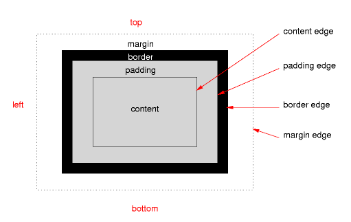
Here is the reference image from W3C regarding the box model:
There are a few problematic properties (float and positioning) that further alter the computations of the width, height and margins, but they are not subject of this article. It is recommended that you simply assume there are no floats in the document and all elements have position:static.
Replaced elements is yet another category of elements that might pose problems with regard to the box model. The content of such elements is replaced by an outside source and the rendering engine cannot decide their properties on its own. The three most common examples of replaced elements are img elements, iframes, and form elements. To give you a better idea, think of them as placeholders: when the document is rendered, these elements need outside help to be displayed. For example, instead of the img tag, the actual image resource is rendered. Replaced elements can be either inlines or blocks and they may or may not have intrinsic sizes (defined by the outside source – such as the width and the height of an image resource).
Here is how box model attributes are computed when they are set to auto:
- Padding and borders always default to 0.
- Margins default to 0, except for block or replaced block elements with a specified width. In such a case, the left and right margins are equal so that the width, left and right margins, paddings, and border add up to the width containing box (please see below).
- Te width and height of replaced elements are intrinsic values, possibly adjusted to preserve the ratio, if one of them is not auto.
- The width and height of non-replaced elements are computed as explained below.
| Attribute | Inline | Block | Inline-Block |
|---|---|---|---|
| width | not applied | available width* | minimum of intrinsic value and available width* |
| height | not applied | from top margin edge of the first child to the bottom margin edge of the last child** | from top margin edge of the first child to the bottom margin edge of the last child |
*Available width is the value of the containing box width, minus the left and right paddings, borders, and margins. The containing box varies according to the position property. The containing box may be the content box of the parent (if the element is positioned static or relative), of the body (if positioned fixed), or of the closest ancestor with a position different than static (if positioned absolutely). This will be reiterated in a future article, when we’ll discuss about positioning.
**If block elements have overflow:visible, their height is computed as the distance between the top border edge of the first child and the bottom border edge of the last child.
Here is a short example to help you visualize the table above.
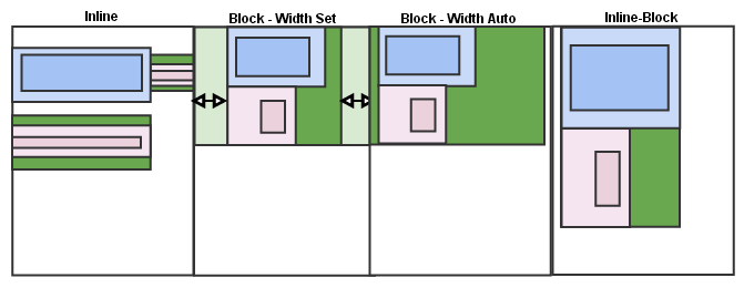
In all images, there is a green element with a blue and a pink child. The margins of each element are rendered with a lighter color. The width, height, and margins of the green element are set to auto, while the blue and pink elements have random non-0 values.
What Now?
As you’ve probably already noticed, several details were left aside. Questions like What is the width of a floated element? or Why doesn’t the padding of an inline element influence the size of the parent block? or What is a run-in box and why would I need one? will all be subject to future articles. Soon, we’ll be discussing the inline formatting context, so if you have questions on inline elements and their misunderstood behavior, they will be answered.
1 Comment
You can post comments in this post.
Admiring the commitment you put into your blog and
in depth information you offer. It’s nice to come across
a blog every once in a while that isn’t the same old rehashed information.
Wonderful read! I’ve saved your site and I’m including your RSS feeds to my
Google account.
raleigh lawyer 9 years ago
Post A Reply