There is almost nothing more hip than Apps these days. Just read there’s an App to turn your Harlem Shake videos into guaranteed success 🙂
JavaScript App development, less visible to the end-user, is very much aided by something developers call Containers. The Container component arranges its items in a special layout.
The container should easily move the contents of an App from one place to another and it should be able to represent the App’s content in a specific layout. Every type of container arranges its items in a certain layout: canvas, dock, vertical stack, horizontal stack, vertical wrap, horizontal wrap.
Dynamic Content
Apps usually offer dynamic features, like changing places between two icons with drag and drop, moving an icon to an empty place or removing an icon from a grid of icons without leaving a gap. Therefore, it’s important to be able to easily move an App’s content from one place to another. The Container component is able to do this if the App uses a container to display its content and if the content is correctly split into items. An item should be considered as one single piece of content that can be moved at once to another place.
Possible Usage Cases
Let’s take a look at the FourSquare App. It has different layouts for iOS and Android because its appearance must be consistent with the UI elements frequently used in the operating system on which it runs. Please observe that the navigation bar is located in different places: on iOS, it is placed at the bottom of the screen, while on Android below the application bar. There is a reason for this placement – Android devices feature function buttons at their bottom part, so the navigation bar is not placed on the bottom of the screen because some users might touch the wrong button.
Take some time and imagine how you would implement this without a container. You would probably use two different layouts for each operating system. This approach is very difficult to maintain. If you want to change something in the layout, you must change it in both layouts.
By using a container things get a lot easier. You just need to place that bar in an item and place that item in the container, but at different indexes. You could use a vertical stack container for this App and arrange the items like this:
- the application bar would be the fist item
- the navigation bar would be the second item
- the content would be the third item
If the detected operating system is iOS, the second item (the navigation bar) is removed from the container and placed at index 2 (the last item from the container). That’s it!
Interesting Layouts
The container usually arranges its items in a special layout. This is why several container types exist and every container type arranges its items in a certain layout. You can find each container type explained below, along with graphic examples that help you better understand their layout.
Simple Container
This container type does not arrange its items in a special layout. Instead, the items are positioned exactly how the user adds them in the container. The advantage of this container type is that is does not use extra CSS or JavaScript to arrange the items in a certain way. This is useful if all you need is to manage the container’s items.
Vertical Stack Container
The items are placed from top to bottom, one above another. If they do not have a fixed width, they are stretched to the entire width of the container. If they do have a fixed width, they may be placed to the left, to the right or in the center of the container’s width.
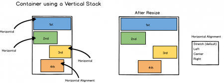
This layout is implemented only in CSS, therefore it will not slow your App.
Horizontal Stack Container
The items are placed from left to right in a horizontal line. If they do not have a fixed height they are stretched to all the height of the container. If they do have a fixed height, they may be placed to the top, to the bottom or in the center of the container’s height.

Canvas Container
The items are placed absolutely in the container at specified coordinates. The coordinates should contain two values: one to represent the position of the item on the horizontal axis (left or right) and one to represent its position on the vertical axis (top or bottom).
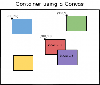
If two items must occupy a common space, the one with a higher index is visible on the common zone. For example, the purple item collides with the red item, but purple is visible because it has index 1, while the red one has index 0.
Dock Container
There are two types of items in a dock container:
- several side items
- one fill item
The side items are placed along a side of the container. They stretch to the width/height of the side, without overlapping the items with lower indexes, e.g. the second item occupies all the height of the container without overlapping the first item, which has a lower index. More than one item may be placed on the same side of the container.
The fill item is placed in the center of the container, occupying all the remaining space. If a side item is added after it, it changes its dimension and position, so it also occupies the remaining space after the new item is added. It can be only one fill item in the container.
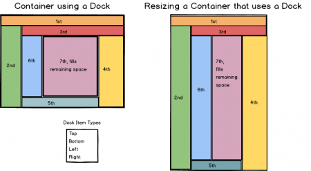
The layout of this container is nice and useful, but it has a disadvantage: it’s implemented only in JavaScript, so it runs extra JavaScript processing every time something changes the layout of the container.
Vertical Wrap Container
It arranges the items from top to bottom. When the height of the container is consumed, it does not provide a vertical scroll-bar, but arranges the items into another column, to the right of the first column. The items are flowing in columns.
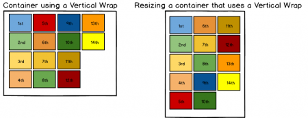
Unfortunately, the CSS specifications for this layout are not implemented yet in all supported browsers, so this layout is implemented only in JavaScript. This means that it runs extra JavaScript processing every time something changes the layout of the container.
Horizontal Wrap Container
It arranges the items from left to right, in a horizontal line. When the width of the container is consumed, it does not provide a horizontal scroll-bar, but arranges the items into another line, below the first line. The items are flowing in lines.
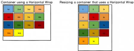
This layout is implemented only from CSS, so you should be confident that it does not slow your App’s performance.
Final Remarks
As you can see, containers enable easy management of your App’s content. Moreover, the layouts help you create a nice, cross-browser appearance of the app without any effort. The use of containers in your Apps is strongly recommended.
While we deal a lot with containers, in the Apps Team we pretty much automated the use of containers at the stack level. If you want to find our more about platform independent Apps, let us know!


Leave a comment